19 Responses to Option A
19 Responses to Option B
12 Responses to Option C
1.
simple/romantic/friendslove
2.
i think the more romantic options are best
3.
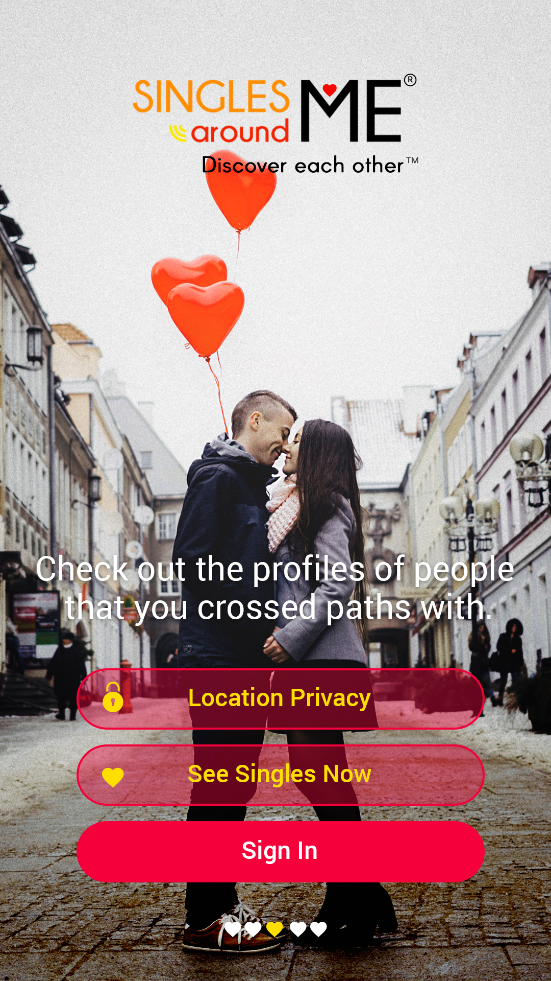
3- they look young and happy it looks like an app to me more than the other two
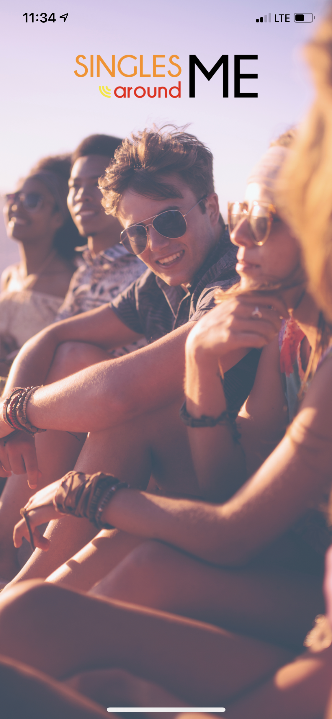
2- this is okay but its a lot going on with the interface
3- it just looks like a poster to me
4.
Images made me to choose the options
5.
.
6.
more casual. young
7.
Hopefully I could get a good and entertaining company for my dating.
8.
App Marketing Strategies to Boost Your Downloads [Infographic] ... “The app was announced almost a year ahead of its release date in ... When you first launch your app, this is when the hype will be the ... How they work is they stick on the back of phones and can be removed to wipe the screen clean.
9.
is very good
10.
IT WAS NICE
11.
ITS LOOKS GREAT, I LOVED IT.
12.
I believe that the second choice looks exciting and adventurous. The option 1 looks uninspiring but not offensive. option 3 has too many people and looks targeted towards partygoers.
13.
It is good love and emotions.
14.
Because the picture in the second option is more descriptive. The background and the balloons that float in the picture makes it very attractive.The kissing post will definitely attract more poeple.
15.
I felt so happy and comfortable by seeing this.
16.
because it’s less standardized and more relaxed
17.
second one is looking perfect with privacy
18.
Option 2 feels more romantic after two people have met and fell in love and are out in public verses the others where it portrays either a couple already established and group of people hanging out.
19.
i trust i would choose my best company
20.
i like all the pictures in that makes me to download
21.
OPTION 2 HAS THE ATTRACTIVE COLOR WITH THE SEXY IMAGE
22.
i chosen base on attraction
23.
The third choice is discarded because it shows way to many people and i think it should show only couples. Liked more the first one because the girl is more beautiful than the second one, maybe because she shows more the face.
24.
All three is attractive
25.
i like all the pictures in that makes me to download
26.
i like all the pictures in that makes me to download
27.
Clear and crisp messaging that enables me to think that this could be an useful app. The images are true and motivational
28.
Option 1 is best because it is simple design and it does not directly show romance and there is no group people in it.
29.
I like the 3 option better because the filter and the aesthetic is better
30.
it looks romantic people and has romance,group of friends that are enjoying
31.
I like option 2 because of the simplistic design and the logo with the heart looks nice. Option 3 looks decent too but I don't really like the lighting and the boring logo. Option 1 also looks alright but I don't really like the white text at the bottom covering the screen with unneeded words.
32.
those are nice picture and design
33.
looking nice
34.
Option two because I like the photowork and genuine connection. Option three makes it look like the main userbase is young and happy. Option 1 is last because it's too cheesy, it looks like a rom-com that made no money.
35.
The third one doesn't show love, just friendship between a group of friends.
The second is great but the buttons for privacy, sign in are too much for a first impression.
It only leaves the first option.
36.
It is very attractive
37.
THEY'RE BEAUTIFUL, HAPPY PEOPLE.
38.
The option 3 seems to be more fun because it has more people together and it shows that there are several options. In addition, the situation where people are appears to be more fun than other images. The number 2 represents being a safe to use app. 3 was the last option because it is the most cliche of all.
39.
I chose option one because they look much more intimate and smiling and in my mind this equates to a stronger bond built on the app. Option two looks intimate aswell just looks more romantic however i prefer a fun relationship over a serious one. The last option i chose 3 as my least likely to make me download because its just people sitting around no serious connections appear to have been made other than a group of friends. It looks out of place for a dating app.
40.
Option 2 is the more intimate of the three, while option 1 looks too much like a stock photo and option 3 just doesn't looks right for a dating app
41.
Option 1 looked like a happy couple and can encourage you to find a partner
Option 2 also has two lovers,but they’re about to kiss so that shows romance and that’s what people want when they go on dating sites
Option 3 has friends together hanging out,it shows a guy looking at a pretty girl,which is quite relatable
42.
1/The option 1 puts a beautiful picture of togetherness for the viewer. It reminds how close you can be with someone and also it reminds you of what you are missing without the APP
2/Alot of couples enjoying themselves in the well edited picture. The smile of the guy makes you jealous of what he has
3/ The picture is beautiful. but there are a lot of information in a single page
43.
over all all the options are looking good i have prioritized based on my preferences
44.
I like the simplicity of the second option, along with the buttons available on the home page...big plus! It was the first to jump out at me and after looking at each in more detail, I like it even more. My #2 choice would be the third option because it doesn't have a couple specifically wrapped in each other, etc. It feels more "fun".
45.
Option 3 is way too busy. Option 1 shows me the romantic partner I could have. Option 2 show people having fun.
46.
Option 1 looked like a happy couple and can encourage you to find a partner
Option 2 also has two lovers,but they’re about to kiss so that shows romance and that’s what people want when they go on dating sites
Option 3 has friends together hanging out,it shows a guy looking at a pretty girl,which is quite relatable
47.
I like option 1 because it feels the most realistic. That's what you're looking for. Someone to hold you and be with you. Option 3 shows the social aspect of it. Option 2 just seems fake and unreal, like something out of a movie.
48.
The first impression is good while we looking for dating and keep imagine about the results. The option 3 is my first choice since its attracted me more than others. Second one also good and the third (option 1) is looks very normal
49.
Option 2 seems sweet - depicts the kind of relationship I would want. Option 3 seems raunchy - the kind of short-term relationship I would want. Option 1 is too twee - I don't see myself like that.
50.
Option 1 is Better.
Demographics
Manage pending orders and track invoices.
Gender (Personal)
Age Range (Personal)
Share Your Results
Anyone with the following URL can see these poll results.